Department Digital Scales
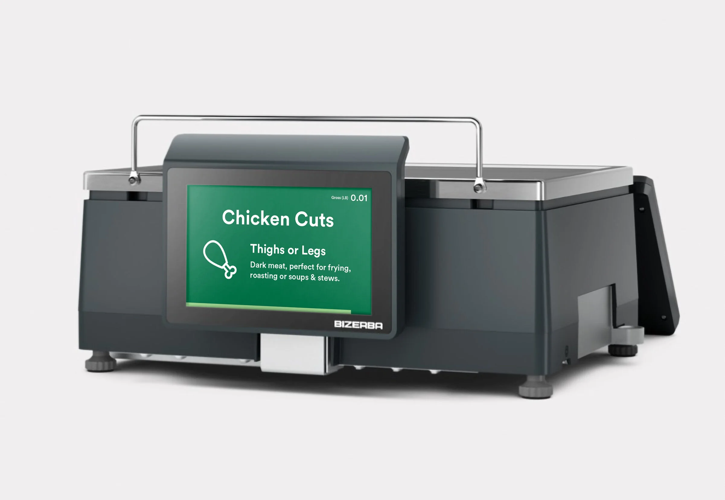
When you walk through a Whole Foods Market you’ll see colorful signage decorating the windows, end-caps, checkout lanes, and department counters. Our signage has always been an important tool to communicate our brand pillars, sales, and seasonal offerings but the digital screens located at our seafood, deli, meat, cheese, prepared food cases, and service counters have gone overlooked for quite some time. These screens were being overlooked or flat-out ignored because of their confusing layout and lack of visual interest or useful information beyond the product price.

The old scales screen left much to be desired.
My Role
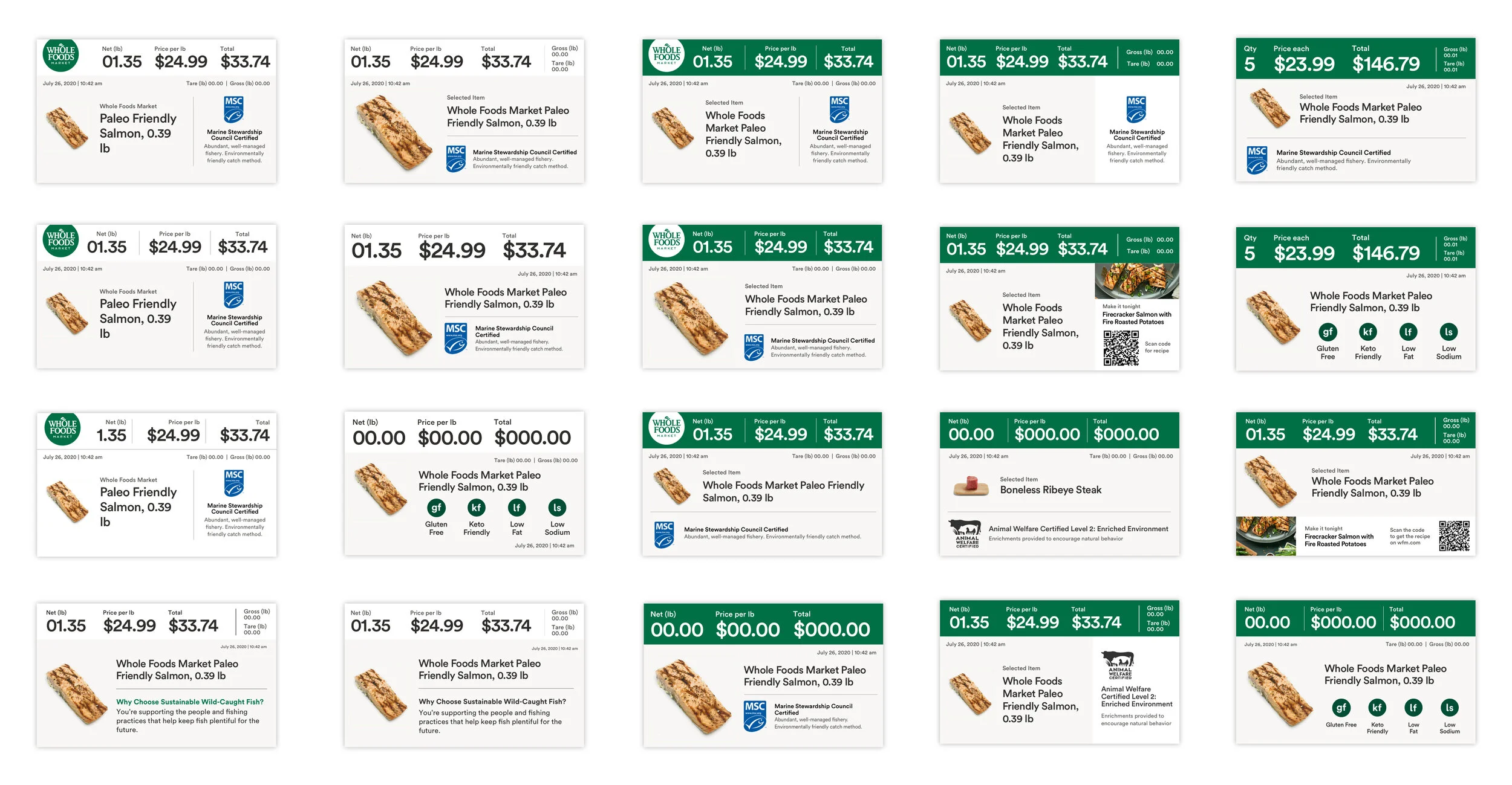
I served as the sole designer on this project, working in alignment with a separate team of two designers who created the team member interface that would work in concert with this customer-facing experience. The team member interacts with a digital touch screen on their side, entering product information and weighing products, which feeds the consumer-facing screen. This small screen tells the customer what is being weighed, its quantity, price per unit, and total cost.
Challenges
The key ask of this project was to update the scales with a look and feel consistent with the Whole Foods Market brand and increase the overall readability. Beyond that, I saw an opportunity to align this project with the current marketing initiative of communicating our key market differentiators, product quality standards, and responsible sourcing. Those goals spawned additional challenges that I would have to overcome to make this an effective experience for our business and customers.
1. Surface relevant information
What information will the customer find valuable and how do you translate it into a bite-sized version that is engaging and retains clarity?
2. Make a more informative experience without the clutter
Customers will be viewing these 4-inch screens from 3–4 feet away on average. How do you make these screens more informative without sacrificing readability?
3. Justify the work by creating value
Beyond making aesthetic improvements, how can we use this new design to bring value to the customer in useful and unexpected ways? How can this design support our current and future business goals?
Approach
The experience would need to improve the users' overall experience and support our business goal of raising awareness around our key differentiators, quality standards (QS), and responsible sourcing (RS). I worked with the consumer insights team to pull existing research on what customers thought of our current scales experience. I found that users desired a higher level of transaction transparency (showing that the scale is zeroed out, net weight and tare, and clear communication of which product is being weighed.) I also interviewed team members to find out what information customers typically wanted to know or found valuable. I then spent time observing customers at our seafood, deli, prepared foods, cheese, and meat counter and created a customer journey map, then began trying to identify areas where I could pair QS and RS information.
The user journey I created after observing customers at our meat and seafood counters.
Designing the experience
I began the design process by building out flows to identify the key screens that would be needed. I also flagged areas that new screens could be used to elevate the experience, offering useful information or fun brand moments. There would be two parts to this experience, a set of idle screens/animations that would display fun and informational content to customers as they waited for service or browsed, and a redesign of the current active screens that displays product information as items are weighted. Within those two types of screens I would need to provide examples of transitions and identify any additional screens that would bring value to the experience.
A breakdown of the types of screens I would need to create.
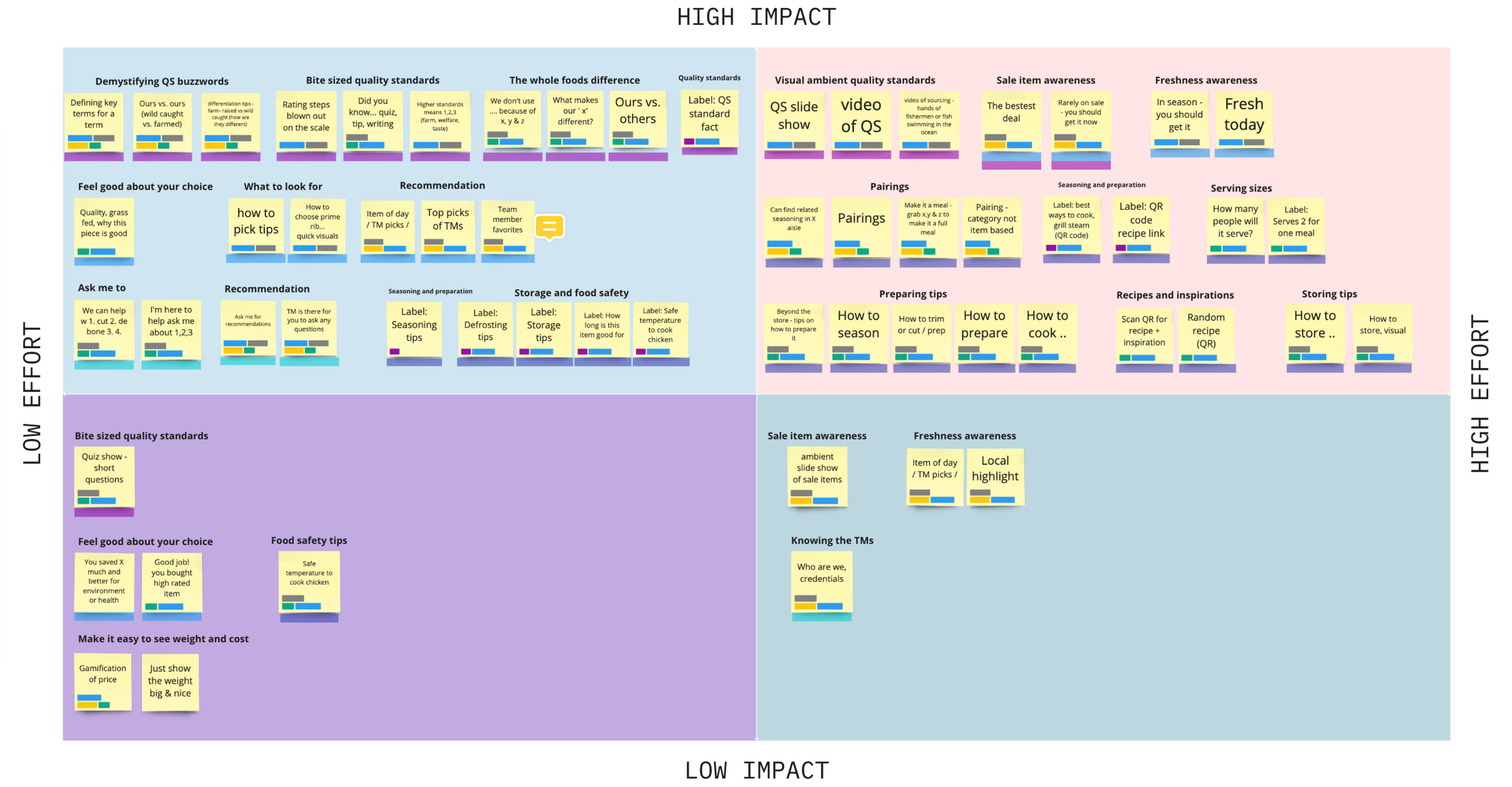
I gathered our research, technical requirements, and goals, and created a list of new features. I then broke these features out into an effort/impact matrix to create a prioritized list and began to explore where these new features could complement the experience.
Next, I created many mid-fidelity mockups to identify what was working and what wasn’t. I find that exploring many iterations rather than polishing a single idea yields a much stronger solution.
During this phase, an interesting challenge arose. There are a lot of important details that make our QS and RS special. How do you simplify the messaging to make it a quick read while retaining a message that's clear enough to justify its inclusion on the scales screens? Design iterations and collaboration with the writing and QS team were essential to finding the right balance.
I decided that some of the features were not suited for screens but still brought value to the user journey. Food storage and expiration information, cooking temperatures, and recipes didn’t serve the action of purchasing so I recommended that those ideas be tabled for the receipt redesign project that was on the horizon. I even provided new receipt mockups for future reference.

After many rounds of iteration and review with the UX and Engineering teams, I settled on a visual system and set of features that elevated the experience. It was now time to assemble key screens which would establish a template system that could be updated with new content as our messaging strategies evolve and new products arrive at our product cases. This evolved from a single design ask into a suite of templates that we could continually update, giving them added value over time.
A looping animation I created in After Effects. It plays while the team member is setting up the scale.
Idle Screens. These are like informative screen savers while the scale is not in use.
Active Screens. These are the screens that display during the weighing process.
Development and Deployment
I prefer to work closely with the engineering team throughout the entire process. Sharing potential features and functionality to ensure my ideas meet requirements and don’t exceed technical limitations. I find that this helps give both teams a clear vision of where the project is headed and eliminates unnecessary churn later in the process.
This project is currently under development and is scheduled to be deployed to select locations in the Austin area for testing in late 2021.
More Case Studies