BrainCheck Provider App
Type Web App // Sector B2B Medical // Timeline 6 Months // Shipped 2024

Background
BrainCheck is a digital platform designed to enhance cognitive care by providing tools for screening, assessing, and managing cognitive health for healthcare providers. Originally developed as a sports medicine tool for sideline concussion testing, it needed to evolve to better serve clinical users and elderly patients.
As the sole product designer at BrainCheck, I lead the end-to-end design process as well as engage in a high-level of cross departmental collaboration to redesign our digital cognitive assessment administration platform.
Research
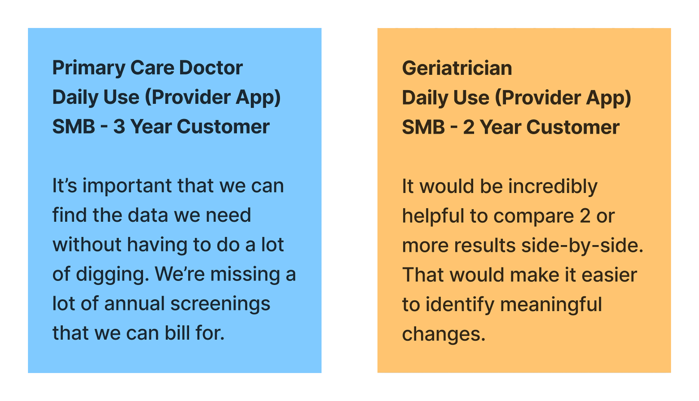
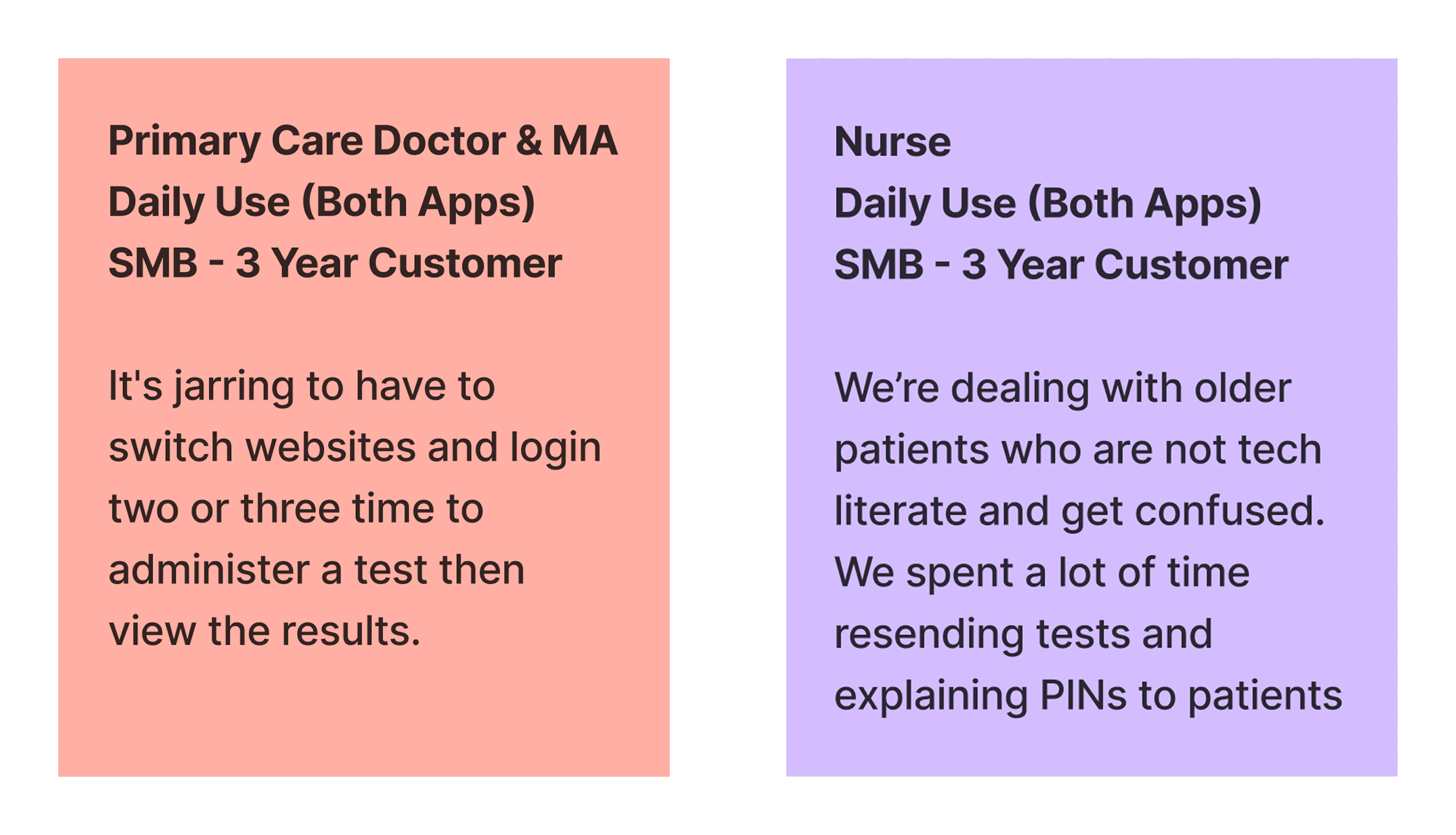
Over the span of three weeks we set up calls with several customers to discuss their experience with our products. We also visited a practice in Houston for a day to better understand clinical processes and workflows. Here are some of the key themes we identified:
Reimagining Product Structure
Users found it strange that features like adding patients, ordering tests, and building custom orders were located in the testing app. This made sense when the product was used in sports medicine and you needed to do all of these tasks on the sideline.

Left: The legacy testing app home screen. Right: Legacy provider app results and reports page.
To improve the experience, we consolidated all administrative features into the Provider App, designating the Testing App exclusively for patients and care partners. This separation clarified user roles and significantly improved navigation and usability.
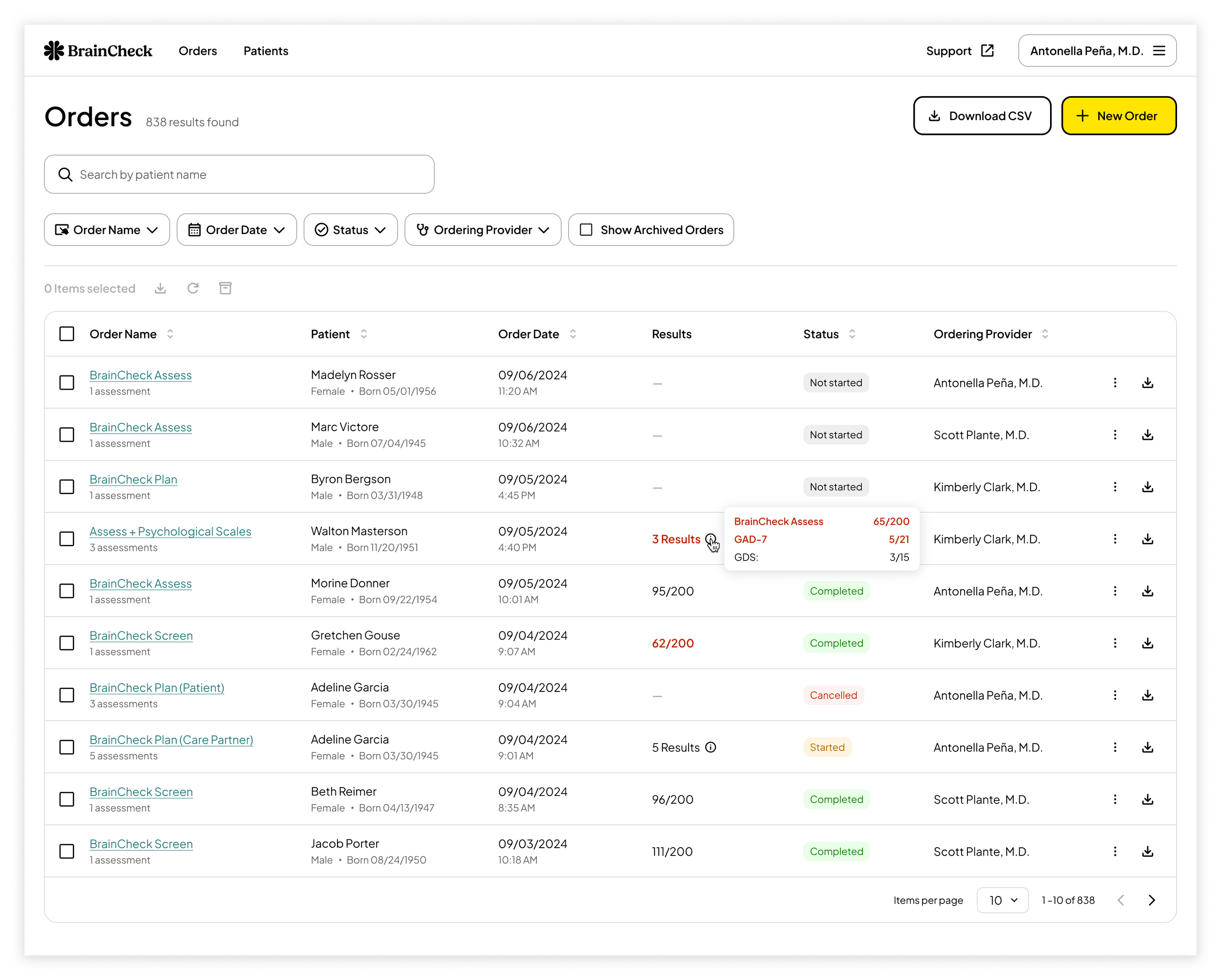
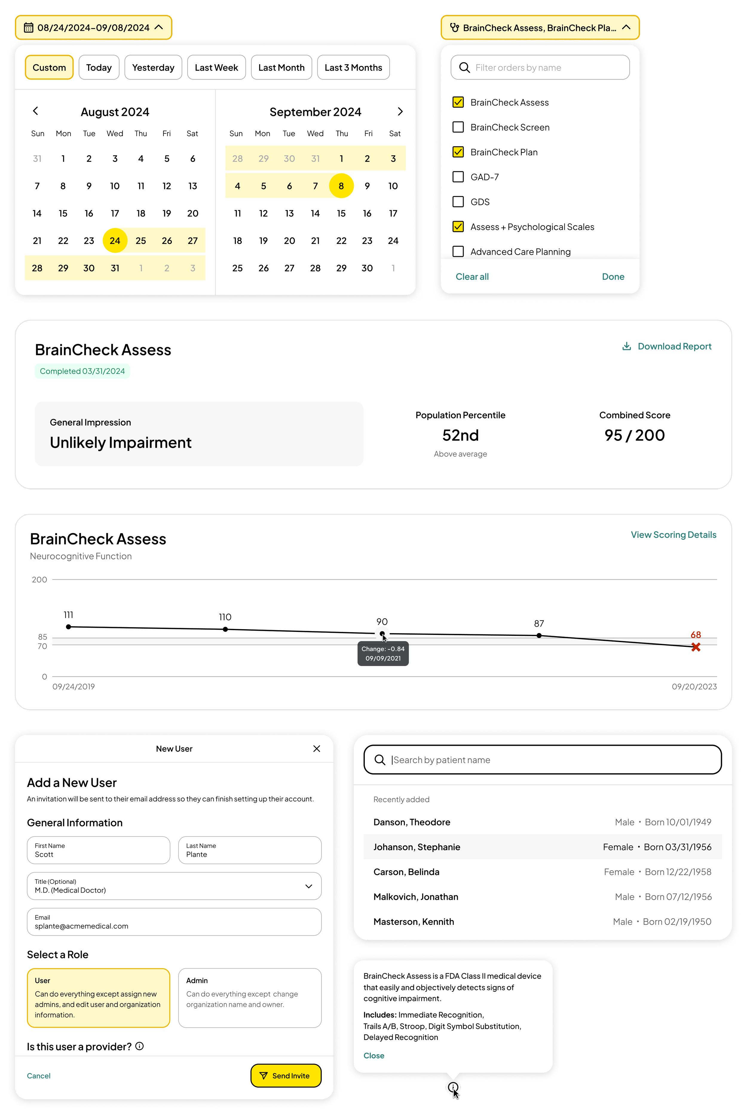
Orders Page: Tests are now bundled into single line items with results displayed in rich tool tips.
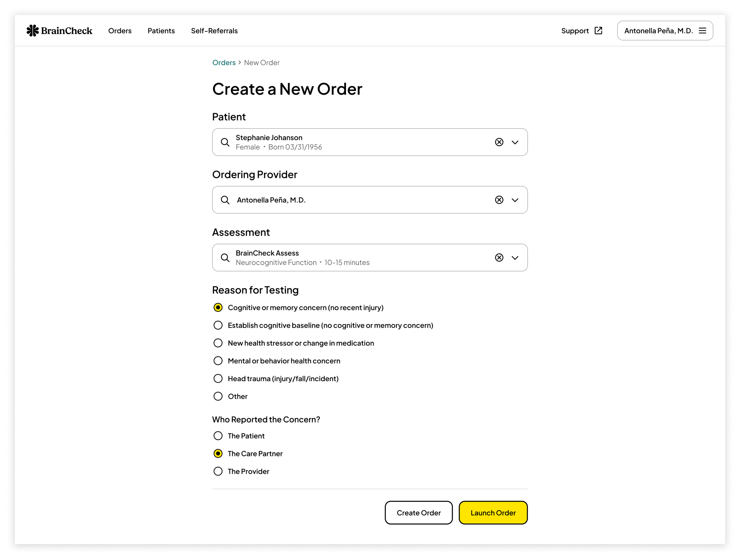
A new order creation flow streamlined the process by automating key inputs:
Assigning patients to an order based on the ingress point.
Assigning users as the ordering provider if they are assigned the provider role.
Selecting a default reason for testing based on the chosen assessment.
Previously, this information was manually entered on handoff screens within the Testing App, resulting in wasted time, awkward clinician-patient interactions, and frequent data entry errors. The new flow improved efficiency, accuracy, and the overall test handoff experience.
Users often encountered interruptions when creating new orders because the desired patient or provider was not yet in the system. To reduce friction and screen clutter, I added an empty state that lets users add new patients.
Empty state for searchable patient selection component.
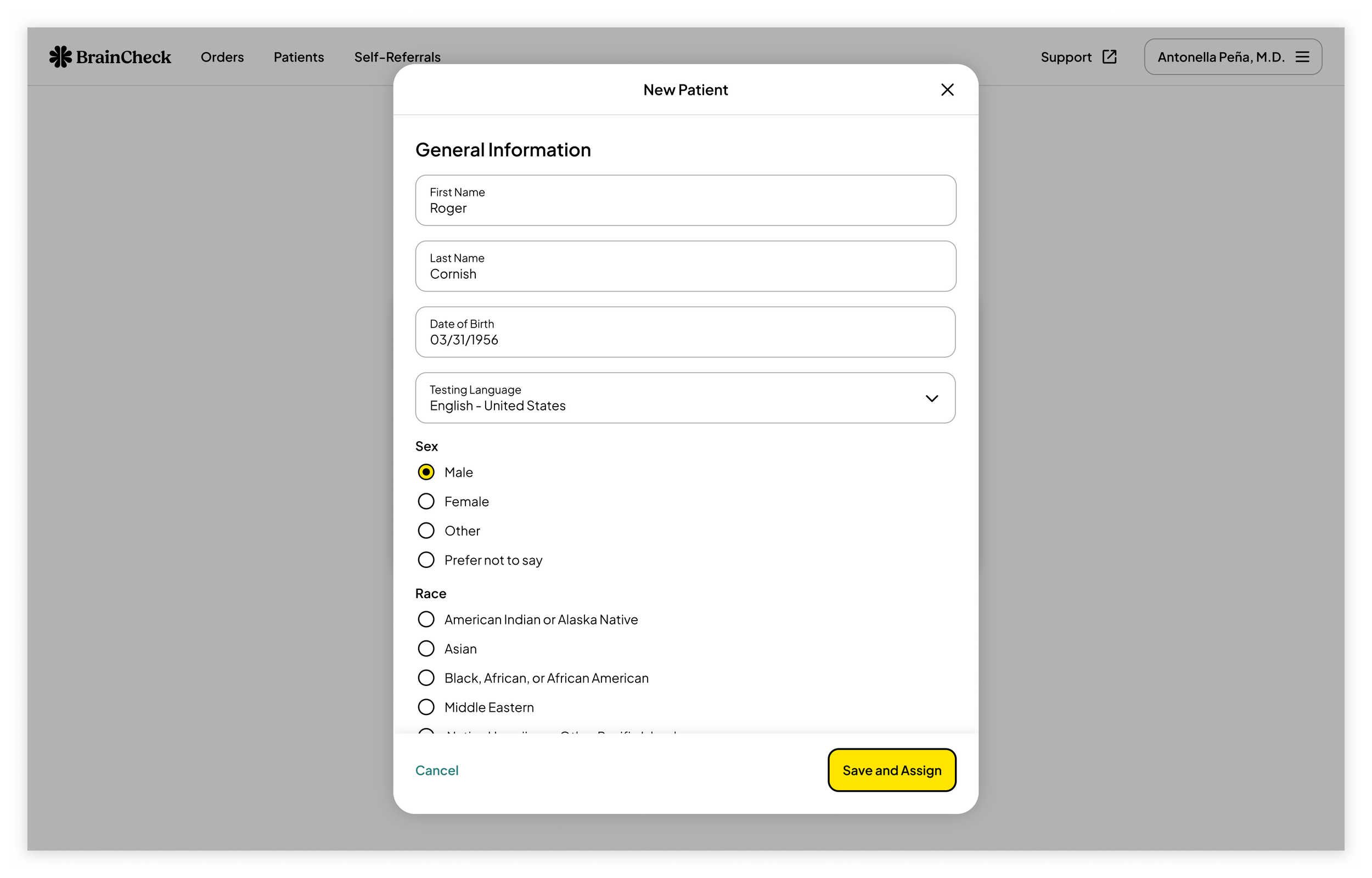
A new patient creation modal allows users to add patients without leaving the order creation flow.
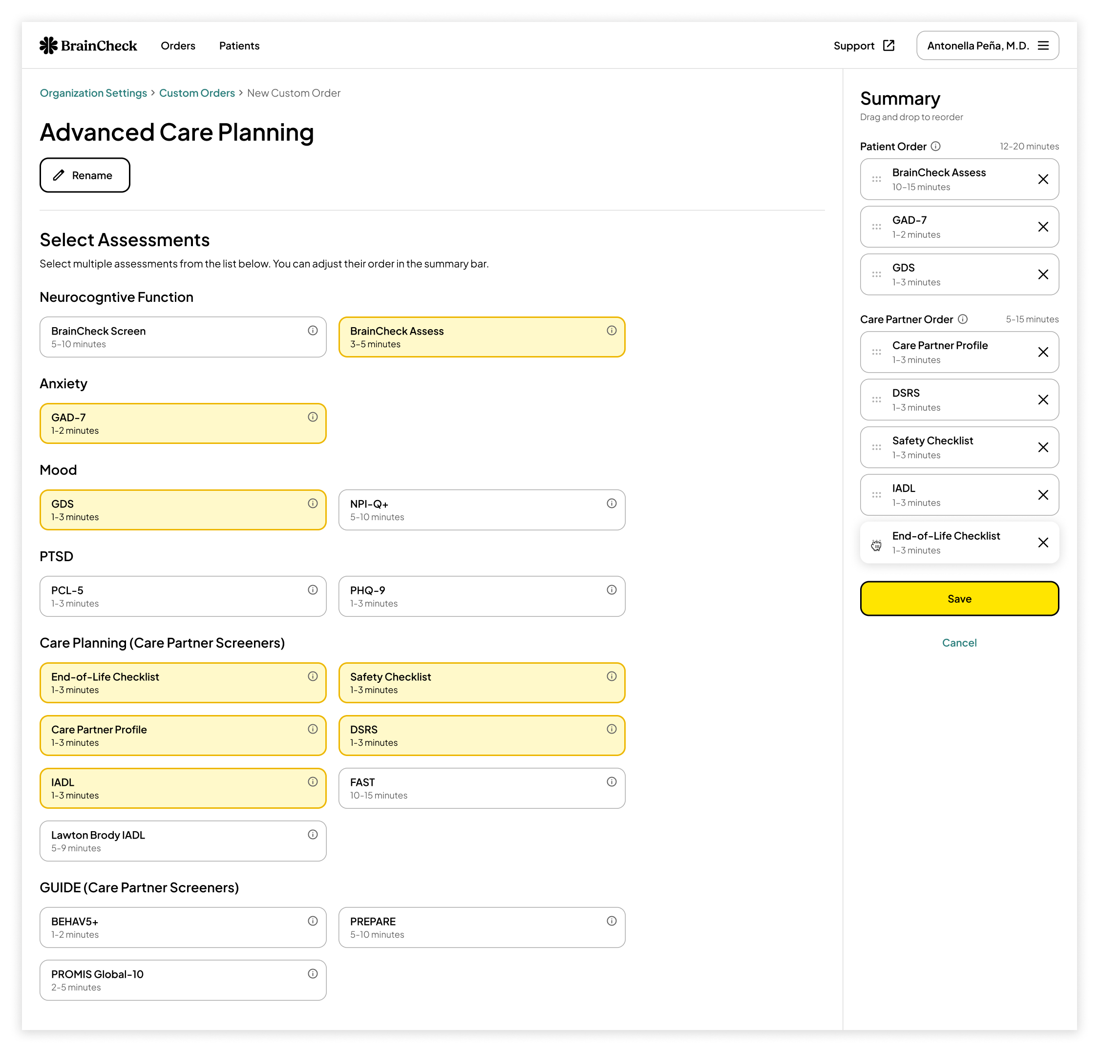
It’s important for clinicians to create custom order sets that align with their organization’s protocols. A modular order creation tool allows providers to quickly generate orders tailored to specific testing scenarios for both patients and care partners. This supports diverse clinical workflows and improves efficiency across care teams.
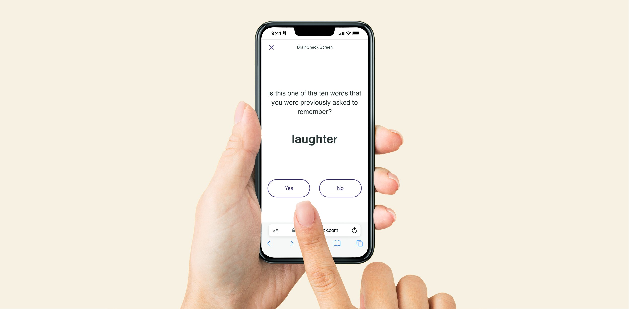
Simplifying Orders
The original authentication process relied on one-time PINs and patient date of birth, causing friction for both test takers and clinicians, especially when tests were interrupted. I collaborated with the VP of Engineering and two key customers to design a more scalable, user-friendly authentication method as well as a new order queue to help test takers keep track of their pending assessments.
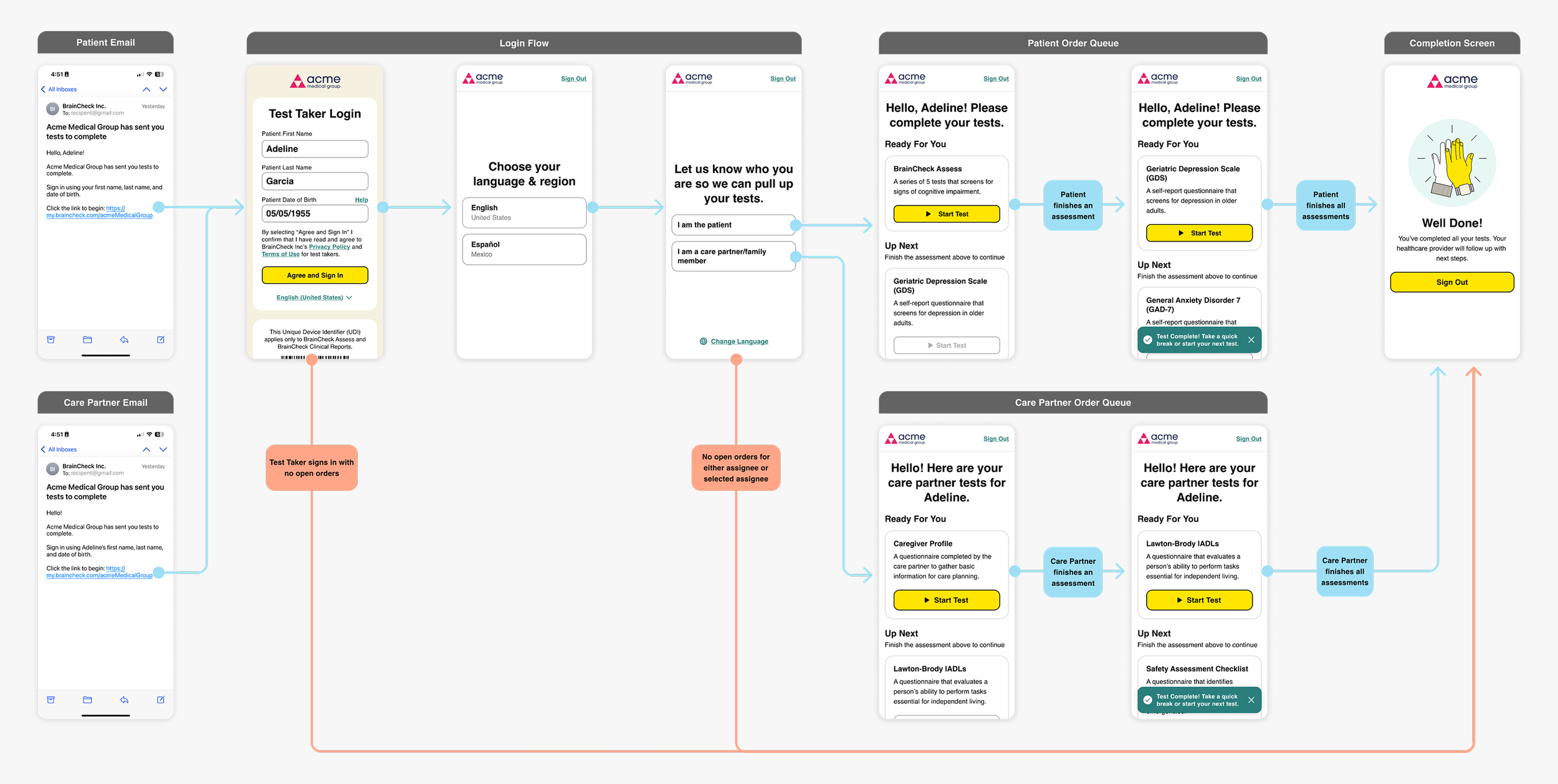
White-label remote login and order queue experience for care partners and patients.
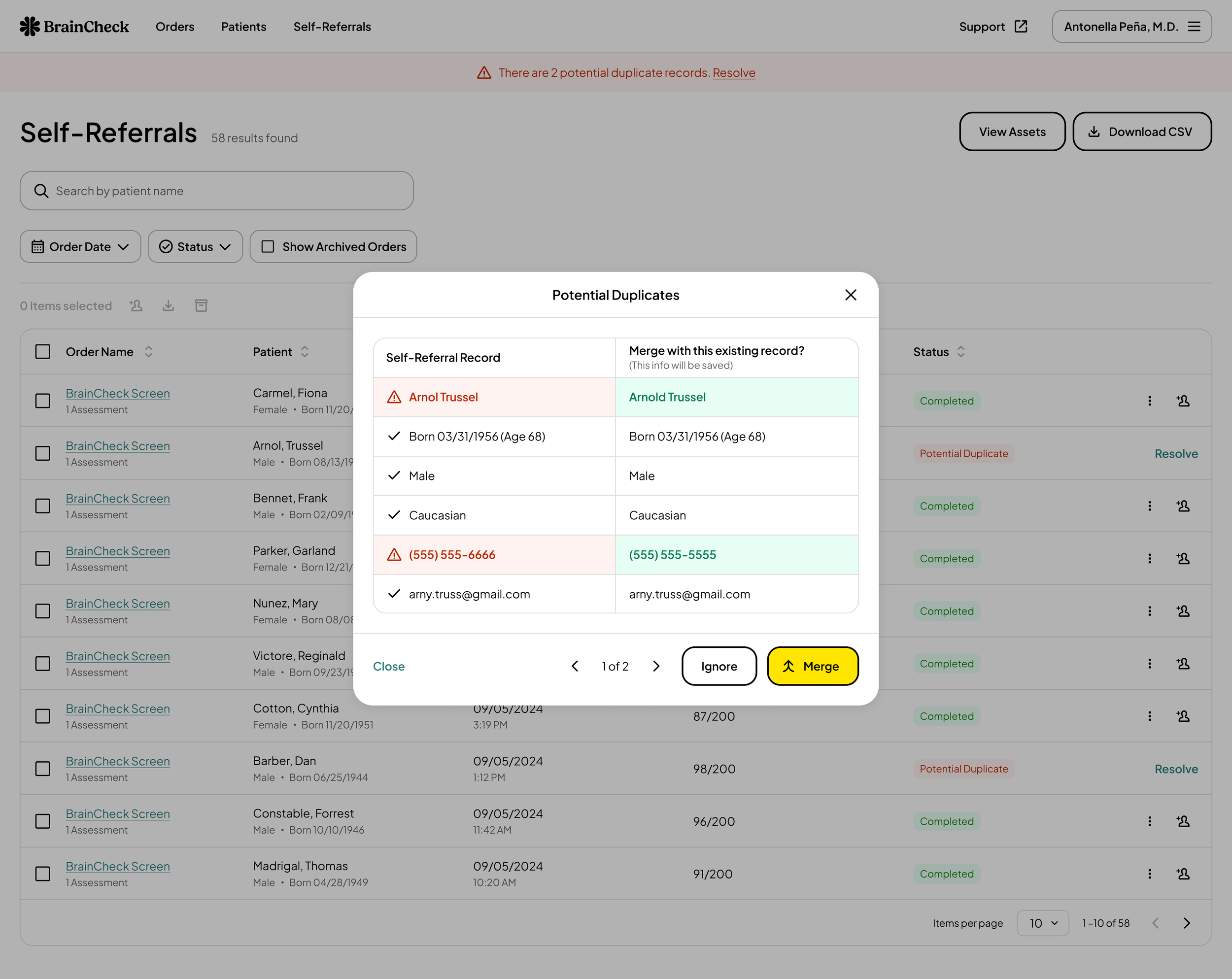
Annual wellness visits present a valuable opportunity for healthcare providers to screen patients for signs of cognitive impairment while also maximizing billing potential. By incorporating self-referral functionality, providers can streamline the screening process for both new and existing patients, improving efficiency and supporting earlier detection of cognitive decline.
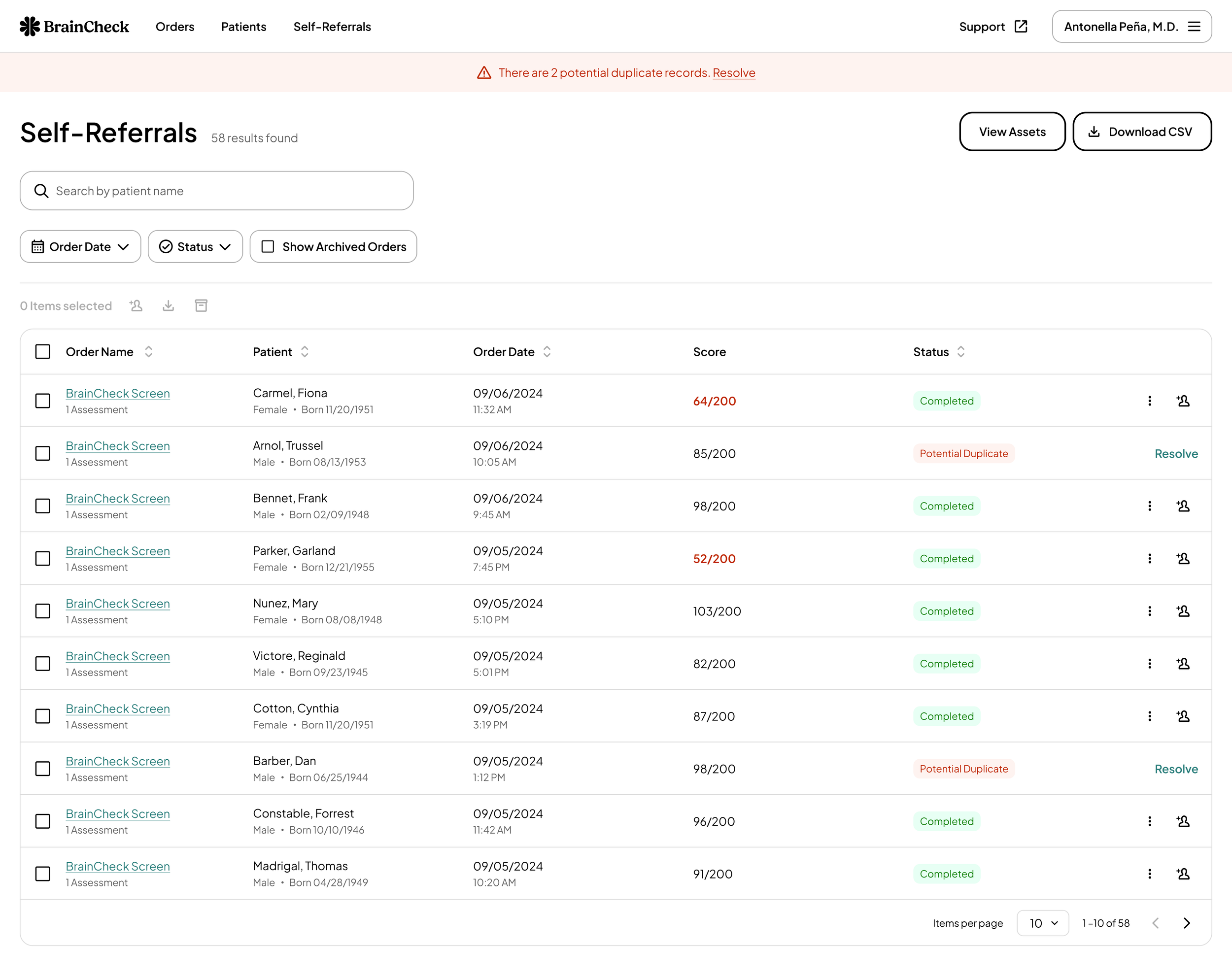
Patients can complete a cognitive screening using their provider’s unique BrainCheck Screen link and view their results immediately. These results appear in the organization’s Self-Referrals table. If the patient information matches an existing record, the assessment is automatically imported into the provider’s system. For new patients, results can be audited, imported, or merged with existing records to maintain data accuracy and integrity.
Helping Users Interpret Results
Previously, when a patient completed a bundle of assessments, each individual result appeared as a separate row in the orders table. Clinicians found it frustrating that they couldn't easily view bundled assessments together. Consolidating results and providing structured snapshots made it easier for doctors to analyze a patient’s overall performance.

To accurately identify meaningful changes, doctors need access to historical assessment data to compare new results against a patient’s baseline performance. Historical trends charts can paint a clear picture of a patient’s cognition and psychological state over time.

The clinical report is the most critical piece of documentation, containing all the data needed for interpretation and billing. Providers need a concise, easy-to-read report that allows for quick comparison of performance metrics while offering guidance when results were unclear. Meeting this need required three months of close collaboration with multiple customers to design a flexible system that could accommodate a wide range of documentation requirements.
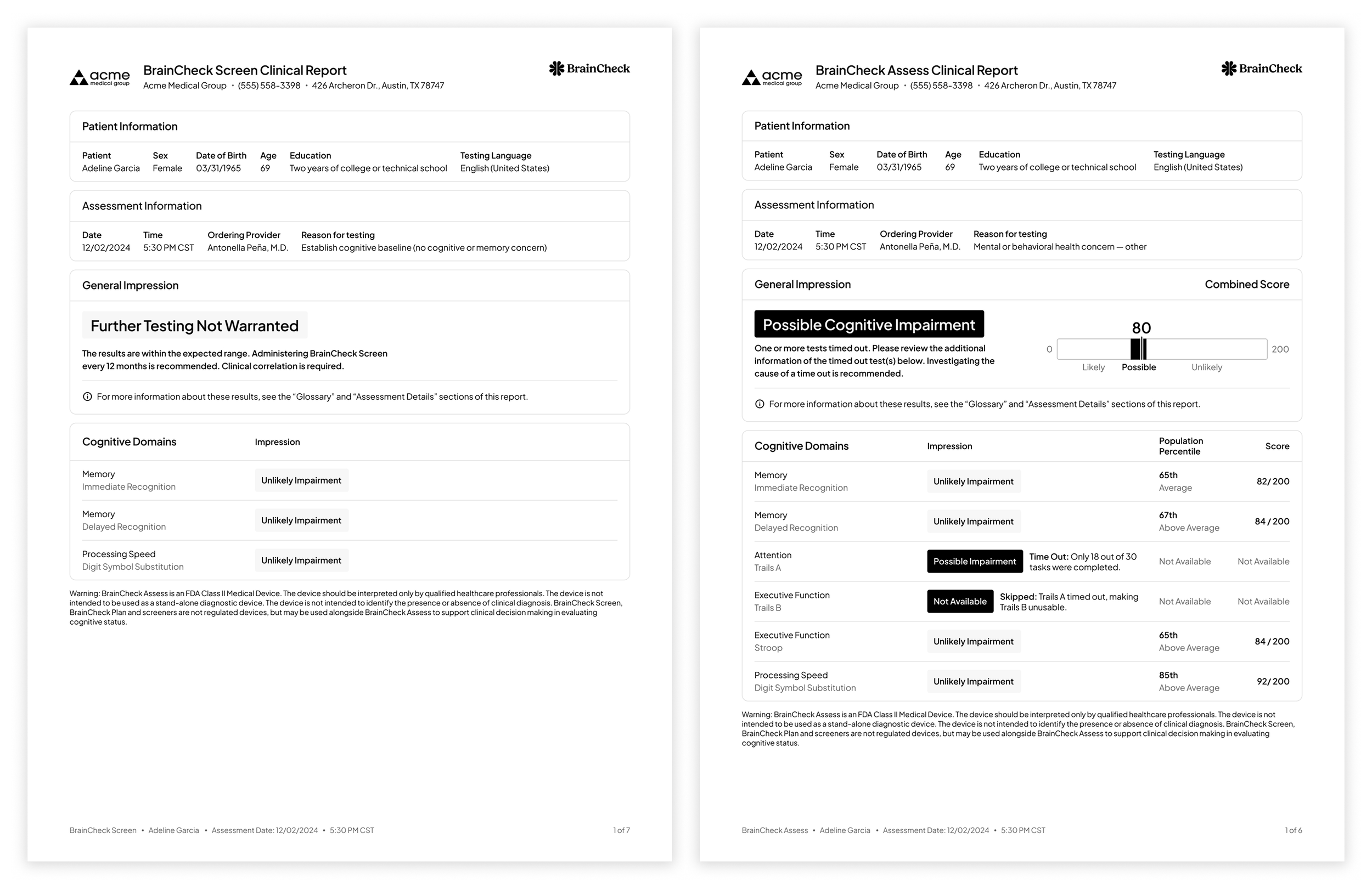
The new clinical report design system created in collaboration with our clinical advisory board.
Conclusion
In early 2024, we migrated several small to mid-sized practices to the new Provider App. While feedback was largely positive, some customers requested additional features such as organizational groups, batch user upload, and batch patient upload. These tasks were typically handled by the customer success team, but the feedback underscored their potential value if implemented thoughtfully. This experience highlighted the importance of balancing usage data with qualitative insights and helped shape our roadmap for future enhancements.
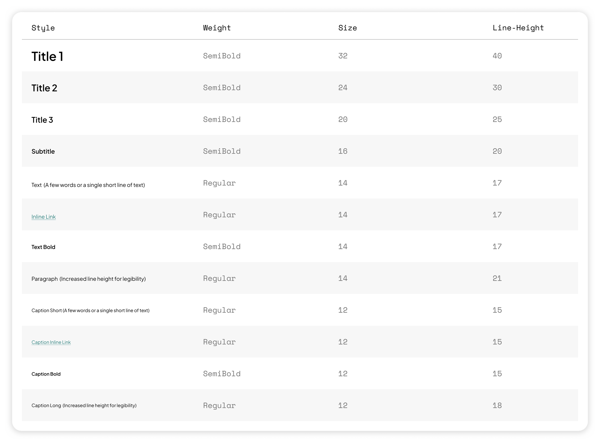
Building the Design System
This project took place alongside BrainCheck’s full brand refresh, which introduced uncertainty early in the design process. To ensure alignment, I collaborated closely with our branding agency, regularly reviewing their marketing work to extract visual cues that could inform the product design system. Early communication and thoughtful adaptation of brand elements for a SaaS context were key to creating a cohesive and unified brand and product experience.
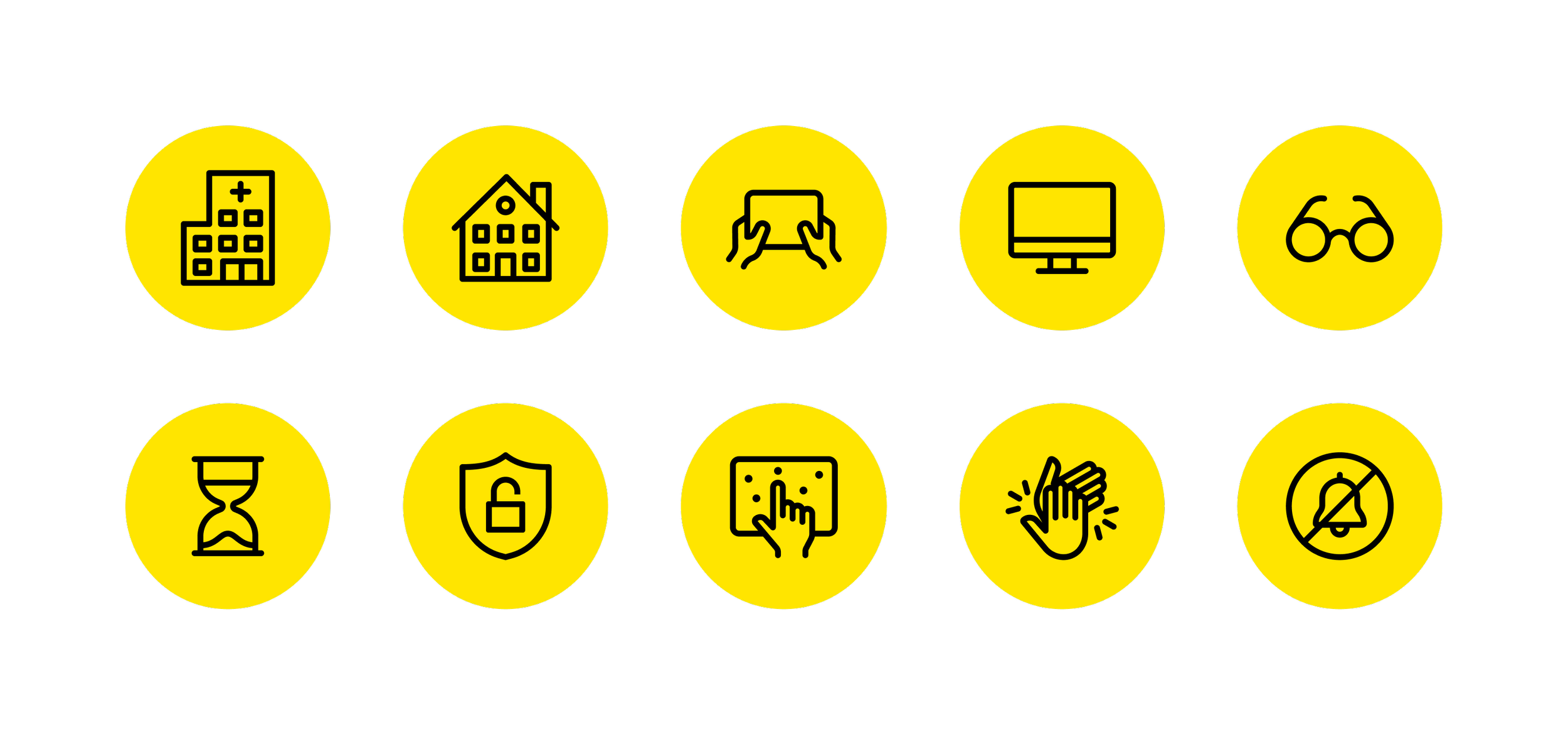
I designed a custom icon set for the Provider and Testing App.
I designed custom spot illustrations to help add emphasis to key pieces of information like testing environment guidelines and test completion.
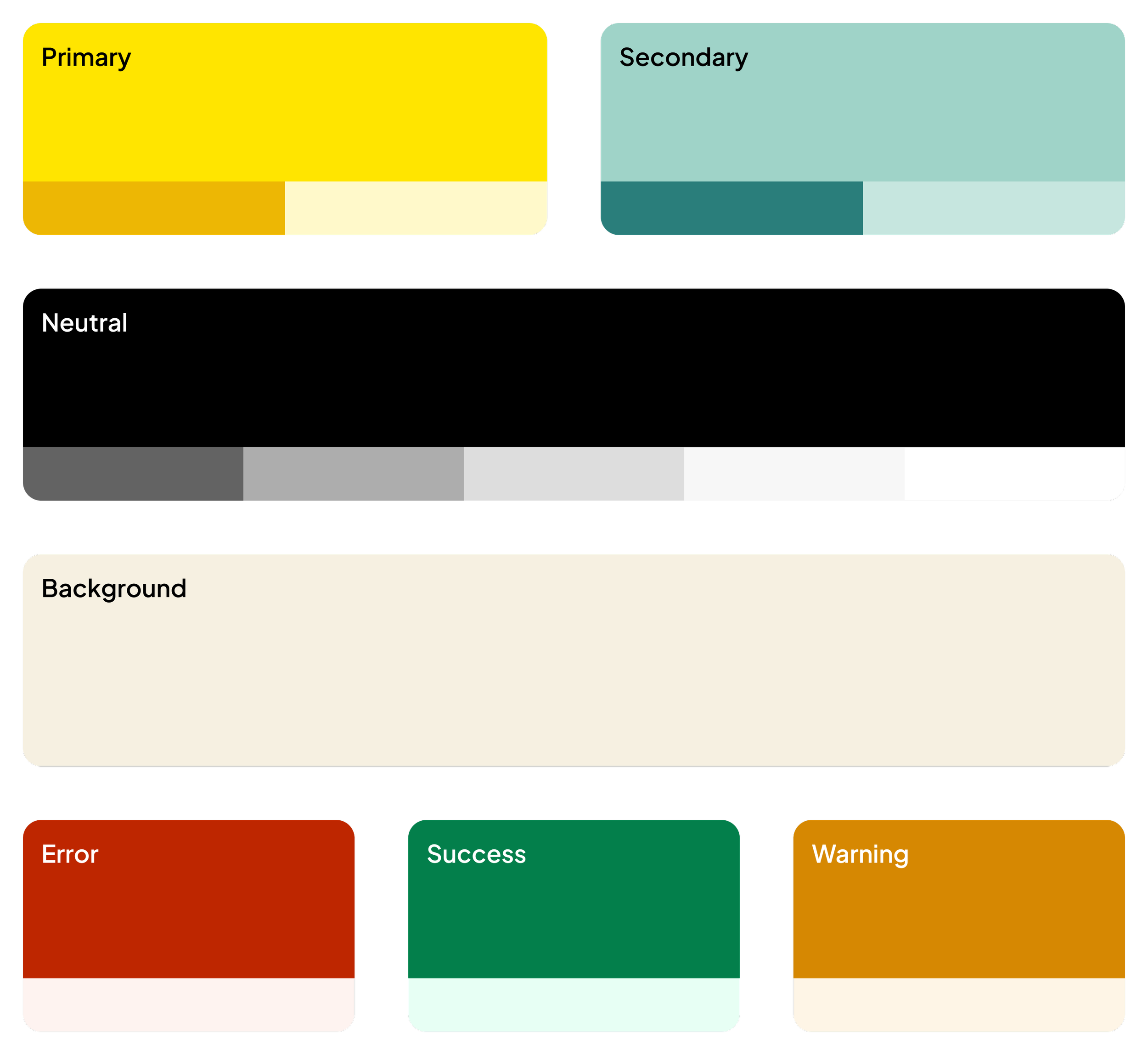
I expanded the existing brand color palette for high contrast and accessibility.
Want to learn more about my process? Let’s chat!
More case studies